
We have run through how to find your product, how to get your domain name, how to make a compelling product description, and create your own ad video. And now, it’s time to design your online store just by several simple steps. You may already know how your online store look is important in attracting your customers and gaining their trust. How can people trust you and want to buy from you when they see your website is badly designed with too many colors, a bad logo, no reviews, and being not easy for them to navigate. So, in this article, we will help you to get through all those problems.
Dropshipping Guide: Design your online store
We will begin to show you how to design your online store and set everything up on Shopify. In fact, you may want to create your own website or create your store on many other platforms, or you may even have a dropshipping agent to help you. But all in all, you will have to improve your store design with the below parts:
- New Domain
- Logo
- Color Scheme
- Shipping
- Reviews
- Apps
- Update Paypal & Stripe
- Test order on your store.
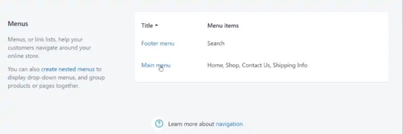
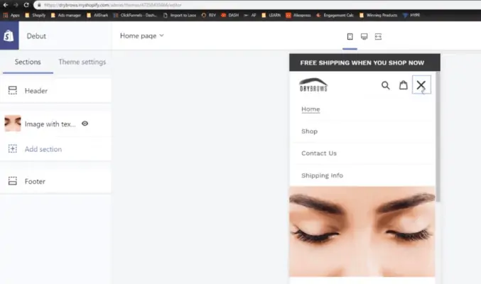
The first thing we need to highlight before you design your online store is that you need to set up the main menu. After doing that, you will have the pages for your store like Home, Shop, Contact Us, Shipping Info.
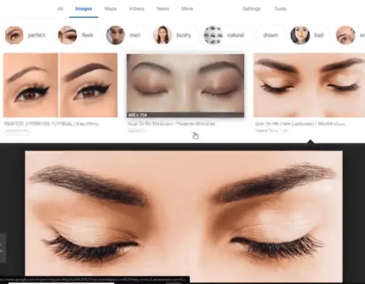
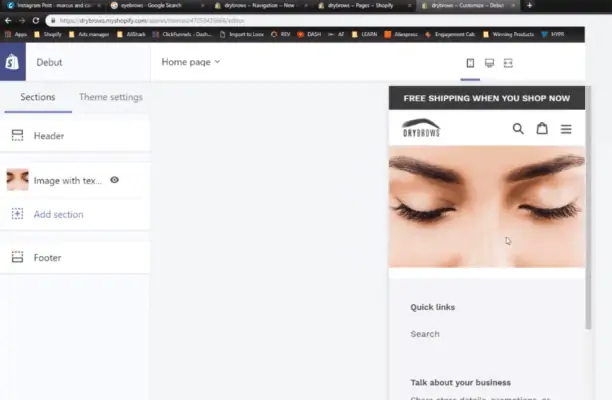
When we create our store, we’ve got nothing here. So, we will have to add the background. Regarding our product is the eyebrow pen, we will go search for the eyebrow photo. Choose the high-quality and clean one, just like the one you see below. We just searched it on Google. It does look really good so we will save it to use as our background.
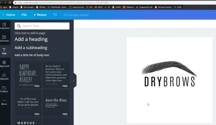
The next thing you need to do to design your online store is the logo. We would search for the eyebrow design itself on the internet and choose the one with a simple design. Then you bring the picture to canva and design it to be your logo.
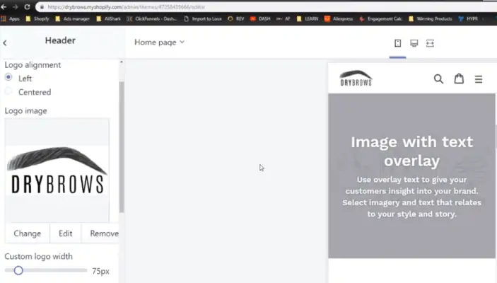
Then you upload your logo into your store. Adjust the size until you feel ok. You don’t want your logo to look so big or so tiny on your page. So, just keep it at a good size.
And then, you make the announcement bar. Type the announcement you want to add there, for example, “FREE SHIPPING WHEN YOU SHOP NOW”. Change the bar color to black. We recommend that when you design your online store, you should always use three colors in your store: black, white, and one action color. Don’t use more than three. Using too many colors will make your page look really bad.
After finishing your announcement bar, delete all the text if any, and upload your background into your store.
As you can see, in the drop-down list we have Shop, Contact Us and Shipping Info as we design up there.
Then we will add the product right below the background. Down the page, we will add up a few things like the newsletter, and the heading right above.
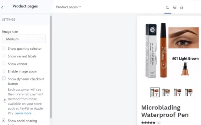
After that, you click “Shop” and it will lead you to the product page. On the product page, you just make some adjustments, it depends on how you like it. You can remove some unnecessary things here like “Show variant labels”, “Enable image zoom”, “Show dynamic checkout button”, “Show social sharing button”.
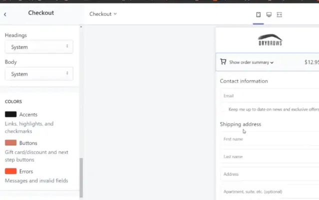
Go to “Theme setting” and change the color so that it’s consistent with the color of your page. For example, here we choose red to be the action color so we would change it into the red one.
Then we go to Check out page and make the design just like the rest of the page like logo, color, and everything.
So that is all you have to do to design your online store. You don’t need anything extravagant to make sales. Just make sure your page is basic and simple like that. We assure you this is enough to sell. Many successful stores just have the most simple and basic design.
With the example on Shopify above, we hope that you can get a basic idea of how to design your online store. Even if you are creating your own website, or on other platforms, you still know how to make your store look good and professional.

Pingback: What Is Business Accounting? Helpful Tip To Get It Right (2022) – Sourcing Agent Dropshipping News